


How we build an accessible design system at HL Tech
Who are we?
HL Tech is a technology centre focused on providing cutting-edge software solutions for Hargreaves Lansdown – an award-winning investment service provider on the British Market. We believe in quality and innovation, that is why we implemented best practices into our daily workflow. But more than that, we are a team of specialists willing to learn and share knowledge.
Accessibility rules (pun intended)
Implementation of Web Content Accessibility Guidelines 1.0 first published in 1999 and subsequent updates throughout the Internet was a long and painful process. People responsible for the creation of early websites often overlooked or were unaware of these rules. The Internet was still a new medium, and like all new things, it had its infancy problems.
Because of limited technological advancement companies and web designers alike reached for solutions such as Adobe Flash (back then owned by Macromedia) or rich imagery often using animated GIFs to convey their message. The goal was to stand out, be visible, even overly flashy.
The downside? The content was not accessible by default to many people because screen readers struggled with reading Flash websites and images replacing text brought the same problem. Navigation through such websites was exhausting if not impossible for some who were not able to use computer mice or keyboard comfortably. The web, unfortunately, was mostly created for able-bodied people.
You may ask – why should we spend time thinking about the minority? Because all of us can be a part of it at any moment in our lives.
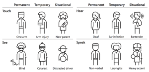
A spectrum of permanent, temporary, and situational disabilities (credit: Microsoft’s Inclusive Design)
The simplest example – an injured arm. Good luck with using a website where you cannot use Tab key to jump around the content or purchase stuff from the online store where you need to manoeuvre with a mouse and activate each address field by a single click.
That is why accessibility guidelines are not for a few, but everyone.
Shared responsibility
Although originally WCAG was aimed to be a guidebook for Web content developers and web-developers, the roles have shifted. Many new professions originated in the process of specialisation. Imagine a regular commercial website – we can positively assume that most of its design, search engine optimisation and content is not usually done by the same person.
Where lies the responsibility for making products accessible?
At ’HL Tech’ we understand that this is a shared responsibility, as it should be. Of course, some areas are better off being solved by developers, while others left for UI/UX designers. Still, we should all learn from each other. It is not uncommon for our teams to talk about ARIA (Accessible Rich Internet Applications) codes and design patterns used in our applications, naming conventions of the buttons or contrast.
Design system as an opportunity
When we first began working on our design system we knew that expertise from many departments would come in handy. This year-long journey originated with three simple goals: user-friendliness, ease of use for developers and look consistent with our brand. Luckily we have many talents within the company – such as Aneta Górka, a Senior Front End Developer in the Design, UX & Optimisation department who gave a brilliant talk and hosted workshops on web accessibility to widen our horizons. Conversations have started, knowledge of our teams grew, and we took this opportunity to do the right thing and add accessibility requirements to our workflow.
Our design process usually consists of three steps: identifying a need for the new component, designing it in line with our brand and third, a crucial one, is code review with a team of front-end developers.
We care for the quality of our React elements base. Nothing will go unnoticed, whether it is contrast and size of the text, missing icon, validation rules, proper ARIA snippets or text.
Together we created something we can rely on in our day-to-day work – we know the quality of our projects is top-notch.
Designs system help us to be more efficient.
When we finish our design and review process for a new element, we test it from many angles. Firstly, our design team checks if the proportions, colours, contrast, WCAG requirements, HTML structure and brand standards are in line with the designs, then it is tested in isolation by our skilled Front End team to make sure it also performs up to our high standards.
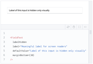
Our Field Text component has an option to visually hide input’s label while still being read by screen readers.
Having this well-crafted library makes not only my job easier by having a working rendition of my design assets, but also is an easy way for developers to translate high-fidelity mockups into working products. It takes just one look to know which element needs to be used.
But most importantly, we do not have to worry if we broke some of the accessibility rules, one would need to try hard to do so.
TB